Task:
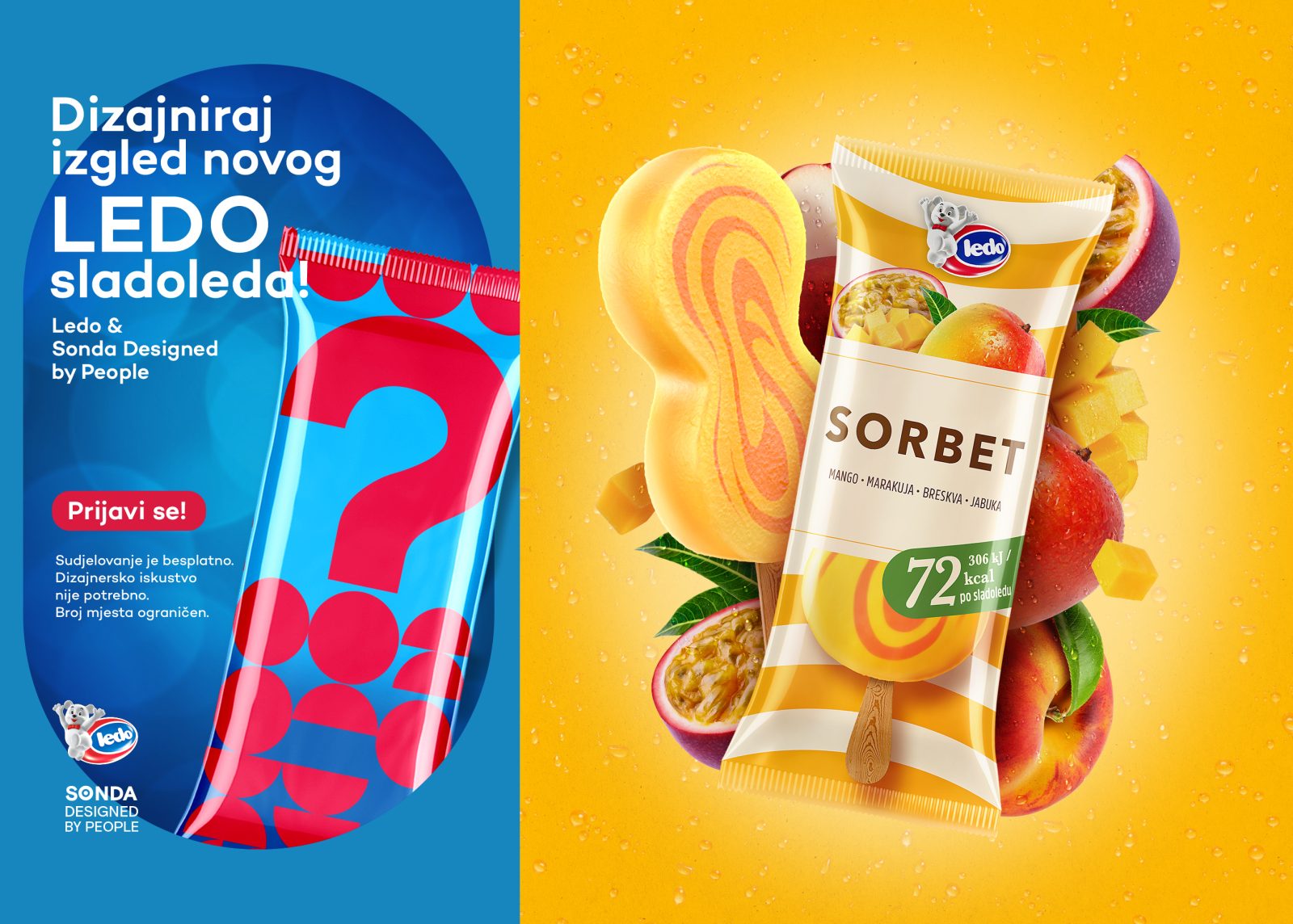
Ledo, the region’s leading ice cream manufacturer, identified the need for a new premium fruit ice cream. The goal was to introduce an entirely new category within its portfolio: a lighter, fruit-based, refreshing premium ice cream with a high fruit content, low calorie count, and no artificial additives. It was decided that the complete branding and design process would be developed through Sonda Designed By People, a creative-educational program that brings together a group of participants from outside the design industry and involves them in the real product development process, from research and concept creation, to the final design solution. Through a mentored process led by Sonda, six selected participants actively took part in developing the new product and its visual identity, both the Ledo and Frikom brands.
Insight:
Today, ice cream is no longer just a dessert. Especially for adult consumers, it has become a small ritual of indulgence between everyday obligations, a refreshing moment without compromise. People are looking for products that feel light and natural, yet still deliver rich flavour and character. A premium summer feeling, the fullness and creaminess of fruit, and guilt-free enjoyment became the key principles behind both the product and the story surrounding it.
Idea:
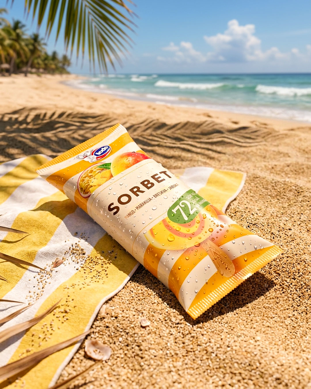
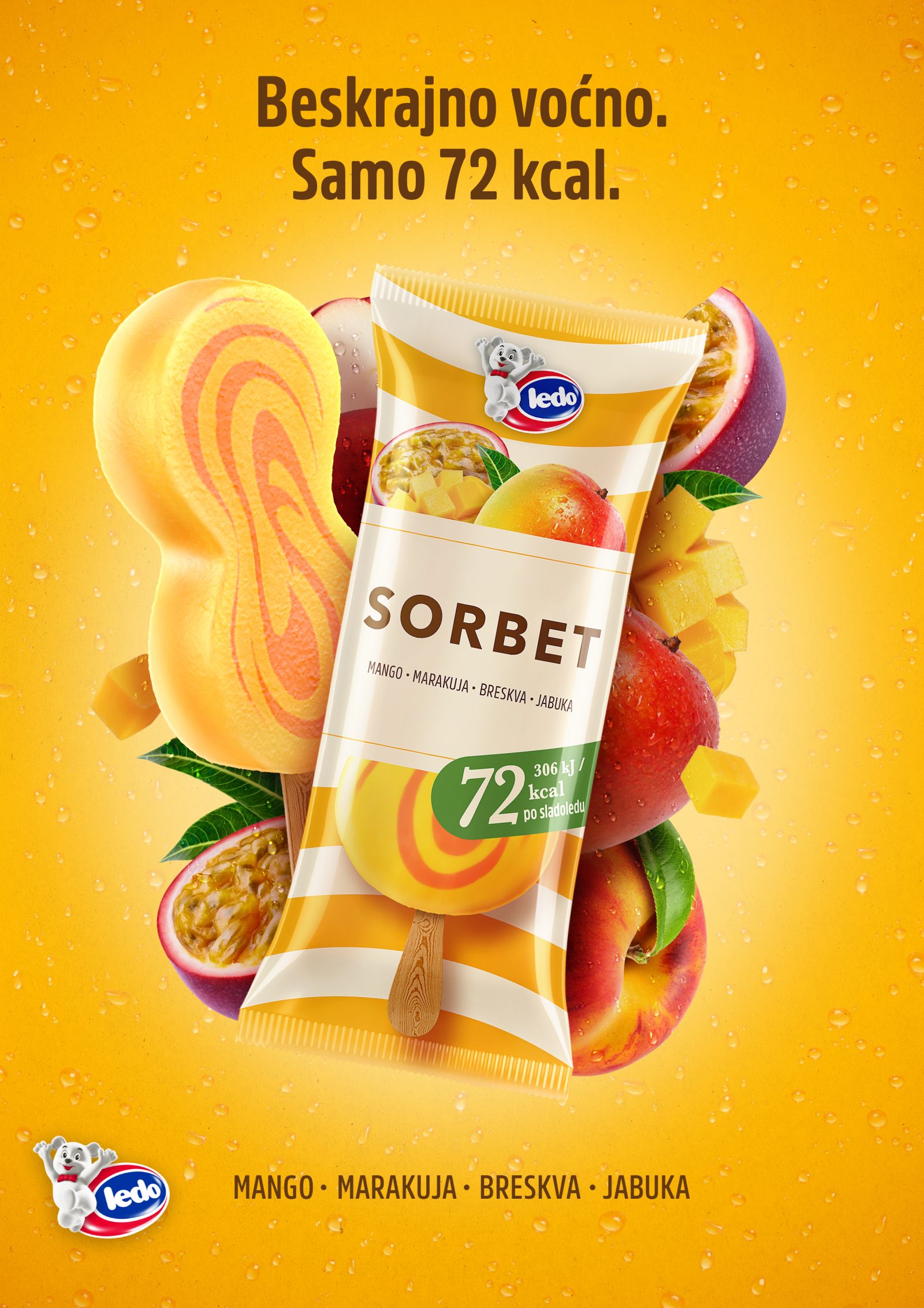
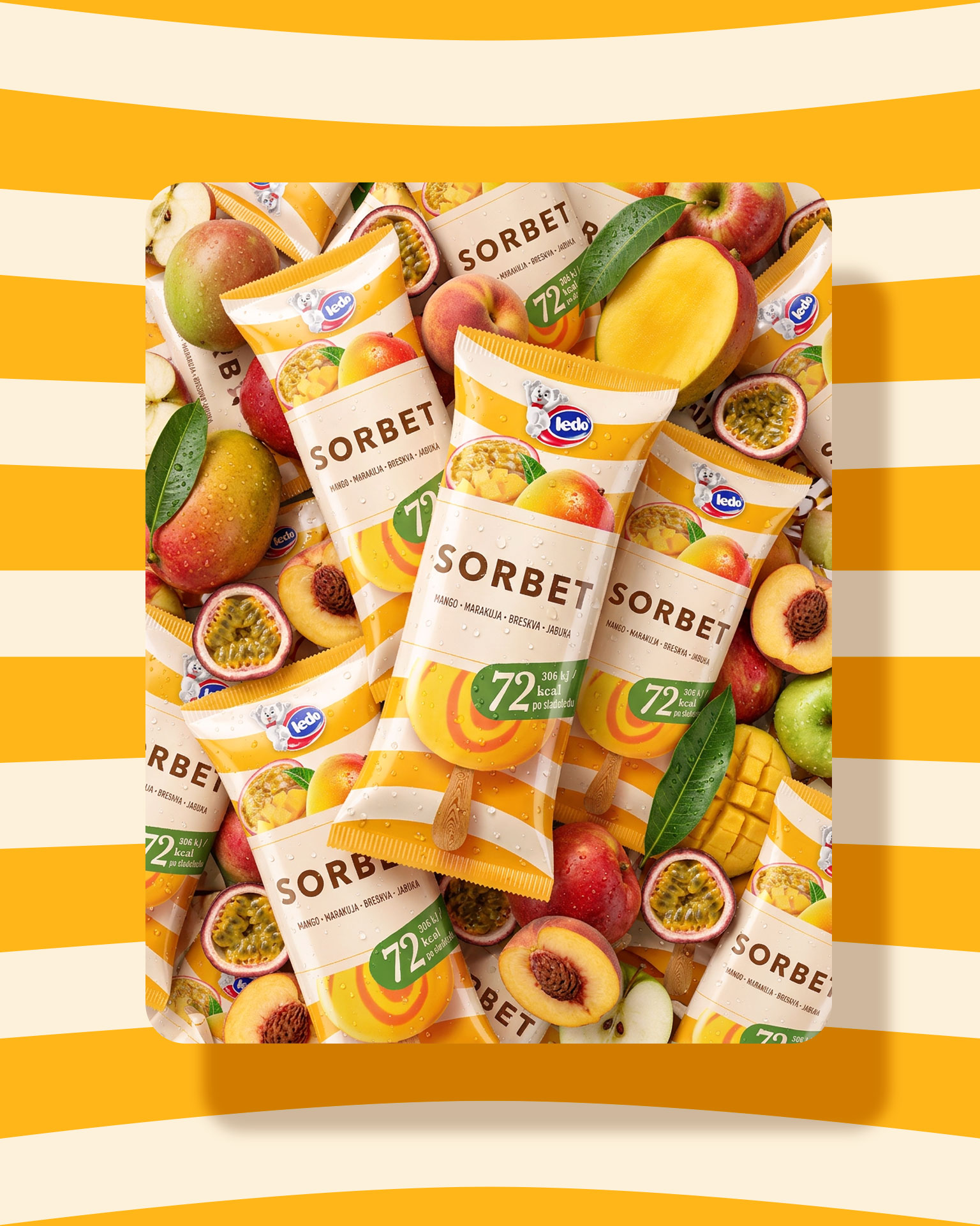
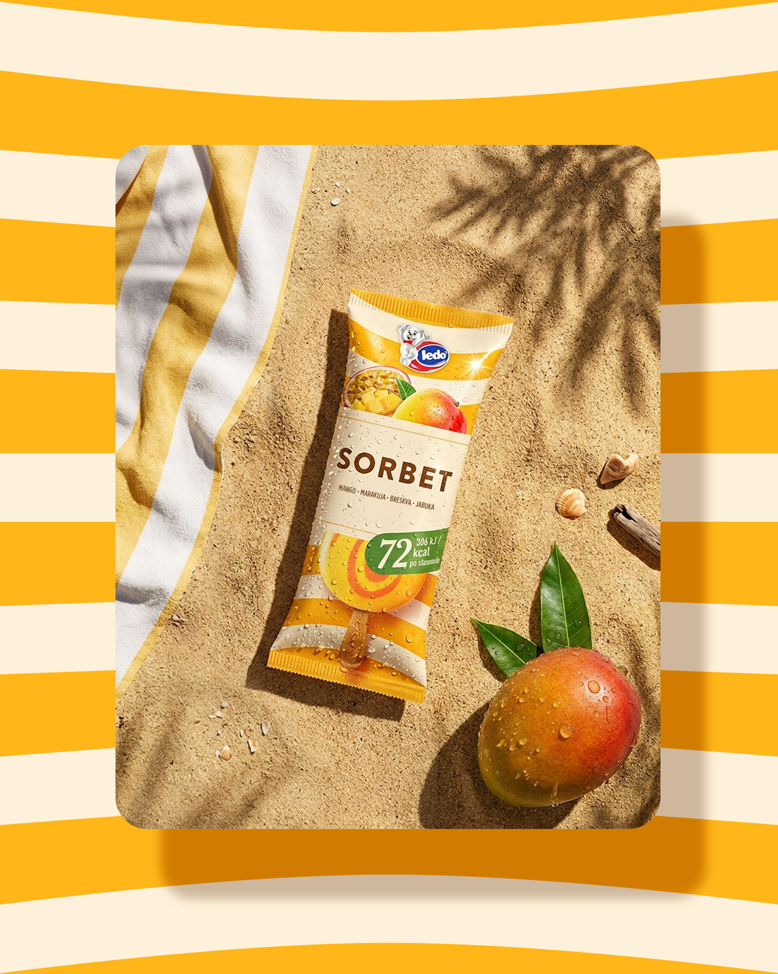
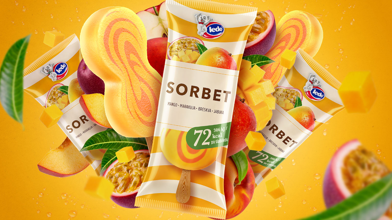
Through workshops held at the Sonda Creative Center in Vižinada, guided by our team’s mentorship, the research evolved into an idea focused on an authentic summer experience, emphasizing high fruit content, lightness, and premium taste. The packaging and visual identity rely on clarity, naturalness, and recognizable flavour cues, combined with summer-inspired motifs, with the goal of creating a product that instantly communicates refreshment and quality at first glance. The product was named SORBET, accompanied by the slogan Endlessly fruity. One phase of the process also included a visit to the Ledo factory in Zagreb, allowing participants to experience the industrial context and production process firsthand. The entire concept is rooted in the belief that relevant design does not emerge in isolation, but through a dialogue between different perspectives, experiences, and emotions, because sometimes the best solutions come from the very people who will later choose the product themselves.
Execution:
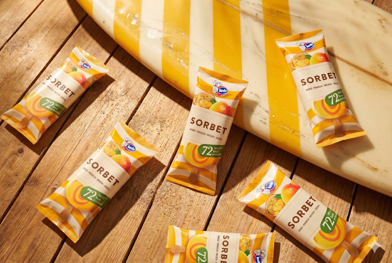
Through the Designed By People program, selected participants spent several weeks actively working on the creation of the new product. The creative process included trend research, moodboard development, defining communication directions, sketching, and developing packaging design capable of conveying the feeling of summer, fruity refreshment, and contemporary indulgence, while also remaining modular and adaptable for future flavours within the line. The packaging design is dominated by warm fruit-inspired tones of mango, passion fruit, peach, and apple, while striped graphic elements evoke the aesthetics of summer that can live within us all year round. Particular emphasis within the visual and communication system was placed on the product’s pronounced fruitiness, creamy texture, and its light, low-calorie nature, with only 72 kcal per ice cream. The clean composition, bold product name, and contemporary graphic elements clearly position the product as a more sophisticated, refreshing choice aimed primarily at an adult audience, combining indulgence, naturalness, and nutritional lightness.
Results:
Designed by People program has demonstrated that collective creativity can result in real, commercially successful products and design solutions that establish an authentic connection with audiences. The product was successfully launched on the market in April 2026 and promoted in May 2026. Supported by a digital media campaign, it immediately gained a strong sympathy among consumers.